Equal Earth vs. Mercator projections

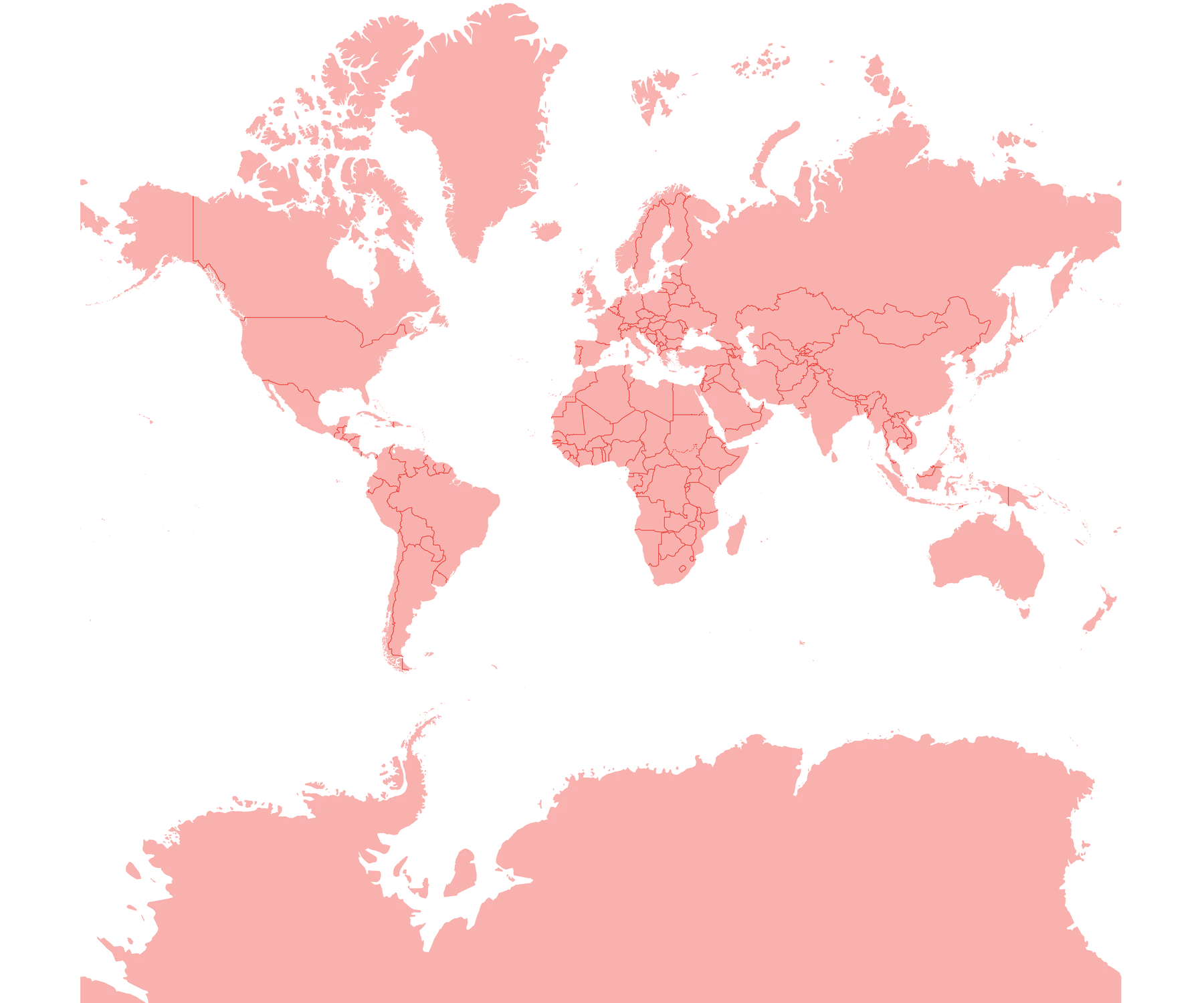
Interactive comparison of world map projections. Drag the slider handle or use the left and right arrow keys to reveal more of the Equal Earth or Mercator map. Use the Show overlap button to view both projections combined.
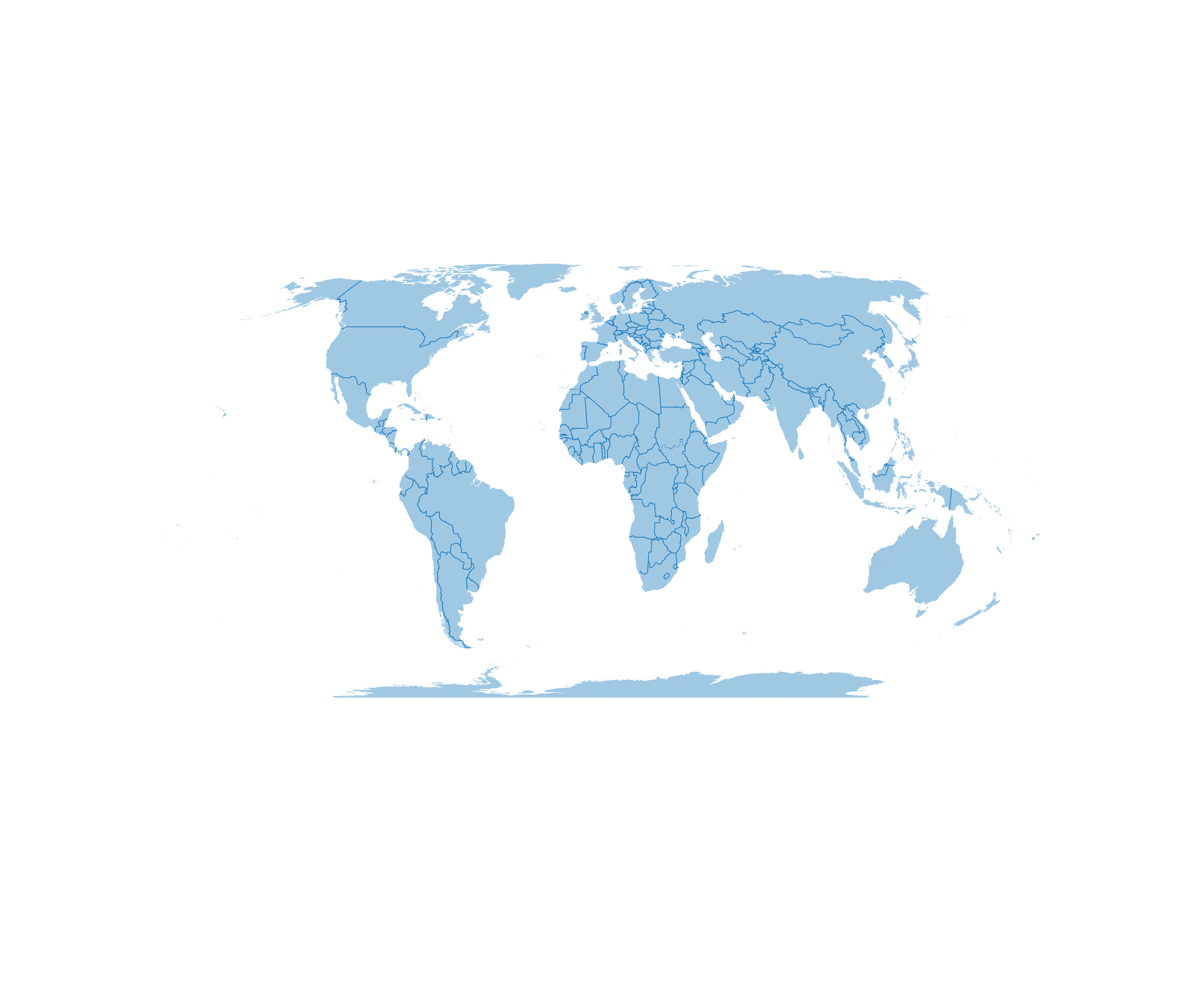
World map in the Equal Earth projection, shown in blue. Continents are displayed with relatively equal area and less high-latitude stretching than on a Mercator map.
World map in the Mercator projection, shown in red. This projection greatly enlarges land areas near the poles relative to the equator.
© Encyclopædia Britannica